Chapter Identity System
7 Chapters · 7 Cities · 7 Identities · One Union
The Music Union 512 · Chapter 512 · Austin, Texas · musicunion.co · Confidential — March 2026
"The master brand provides the foundational connective tissue, but each local chapter adopts a visual identity rooted in its city's unique musical and cultural heritage."
System Overview
The Music Union operates on a chapter-based model, where the master brand provides the foundational connective tissue, but each local chapter adopts a visual identity rooted in its city's unique musical and cultural heritage. This approach allows the brand to feel both globally authoritative and locally authentic.
The master brand, "Institutional Counterculture," establishes the baseline aesthetic: Union Black, Heritage Gold, refined serif typography, and the authoritative MU crest. The flagship Austin chapter carries this master identity in its purest form, while other cities reinterpret the brand through their own historical lenses.
"A member from Austin traveling to New York should feel they are in the same organization, but experiencing a completely different, locally authentic environment."
Chapter Directory
| Chapter | City | Style | Role |
|---|---|---|---|
| 512 | Austin, Texas | Institutional Counterculture | Flagship |
| 212 | New York City | Speakeasy Noir / Prohibition Jazz | Regional |
| 313 | Detroit, Michigan | Industrial Soul / Motown Machine | Regional |
| 213 | Los Angeles, California | Sunset Deco / Cinematic | Regional |
| 312 | Chicago, Illinois | Jazz Age Deco / Cotton Club | Regional |
| 615 | Nashville, Tennessee | Vintage Vinyl / Analog | Regional |
| 305 | Miami, Florida | Neon Noir / Futuristic | Regional |
Chapter Profiles
Each chapter below includes its full visual identity specification, asset gallery, and design rationale. The flagship Austin chapter carries the master brand identity, while regional chapters reinterpret the brand through their city's unique cultural lens.
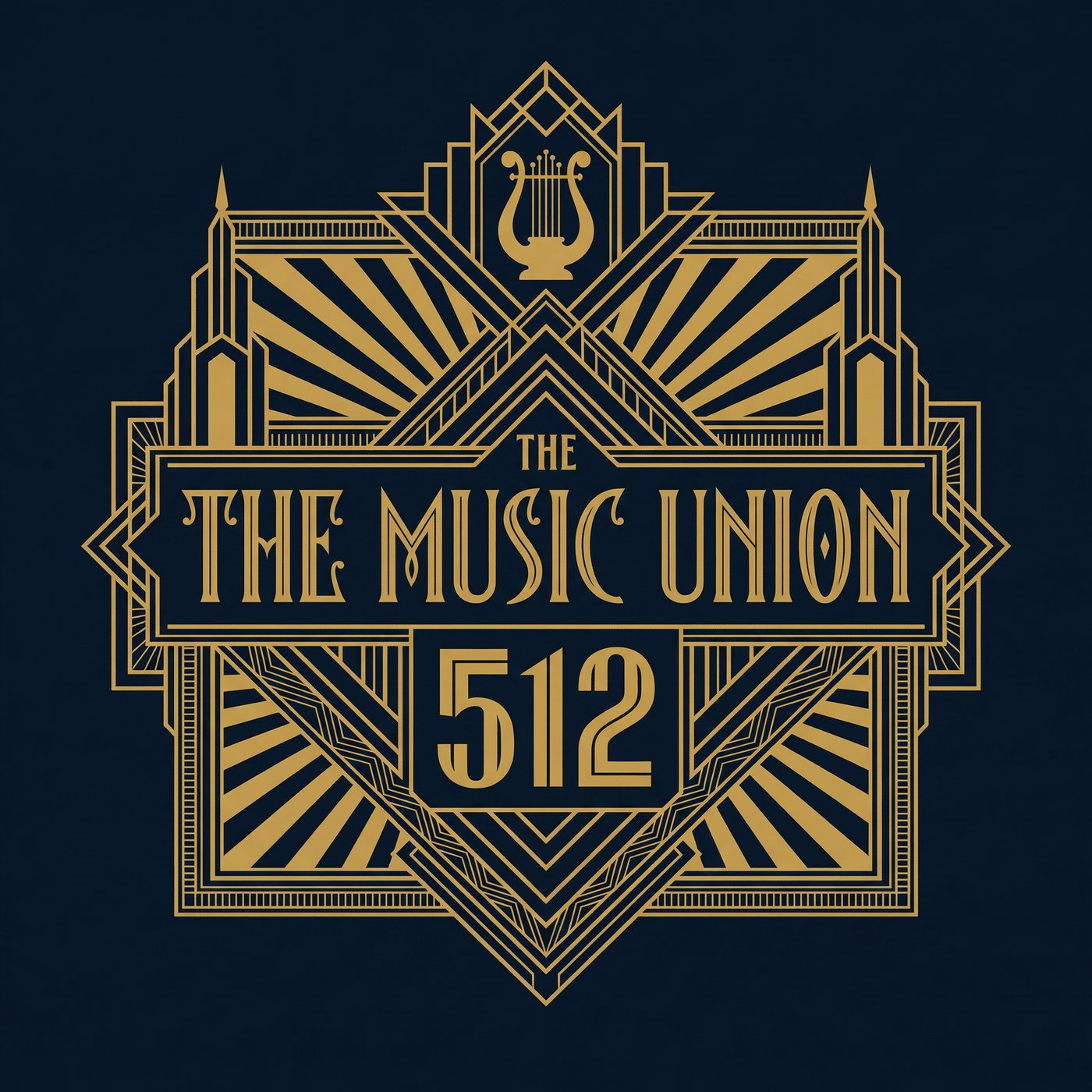
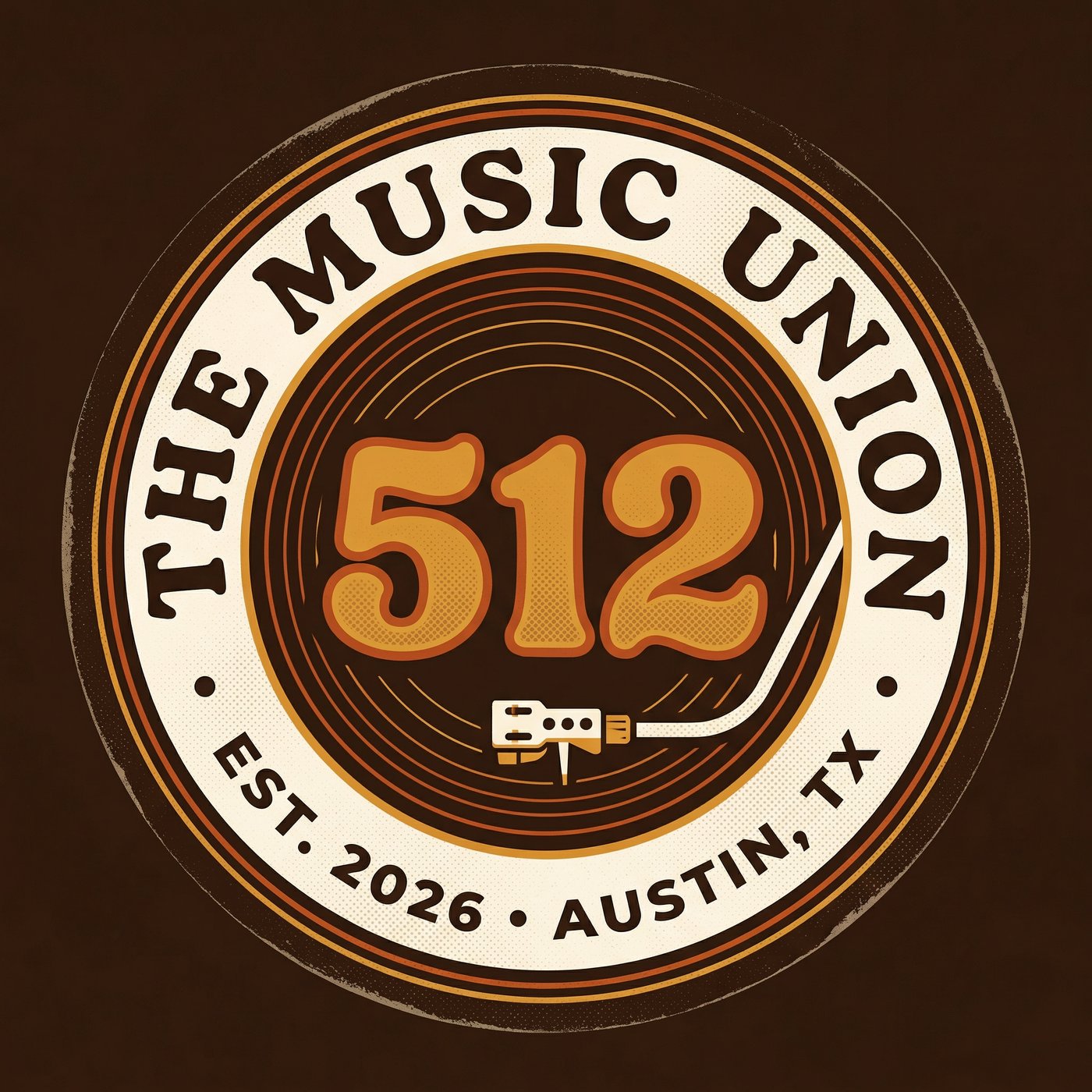
Chapter 512: Austin, Texas
"Institutional Counterculture — The Master Brand"
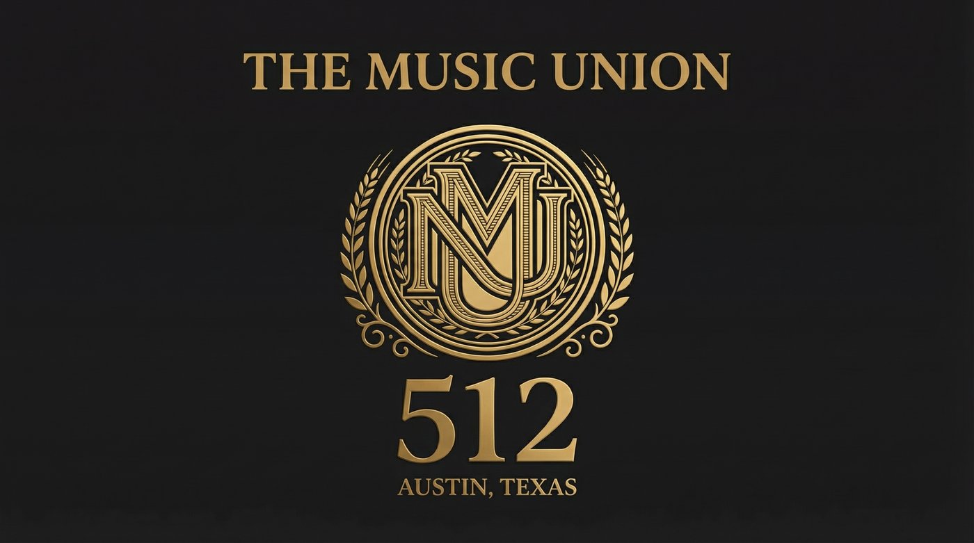
Chapter Crest
| Area Code | 512 |
| City | Austin, Texas |
| Style | Institutional Counterculture — The Master Brand |
| Palette | Union Black (#0A0A0A) · Heritage Gold (#D4AF37) · Warm Ivory (#F5F0E8) |
| Typography | Space Grotesk (display) · DM Sans (body) · Space Mono (data) |
| Materials | Blackened steel · Brass · Concrete · Reclaimed wood |
| Inspiration | Bauhaus meets Texas honky-tonk |
| Role | Flagship — carries the master brand identity in its purest form |
The founding chapter establishes the master brand aesthetic that all other chapters reference. Austin's identity is the baseline: Union Black backgrounds, Heritage Gold accents, and the authoritative MU crest. The building at 4405 Springdale Road is a converted industrial warehouse with exposed steel trusses, polished concrete floors, and brass-accented fixtures throughout. Every surface is designed to be photographed, filmed, and experienced.
Chapter 212: New York City
"The Basement — Speakeasy Noir / Prohibition Jazz"
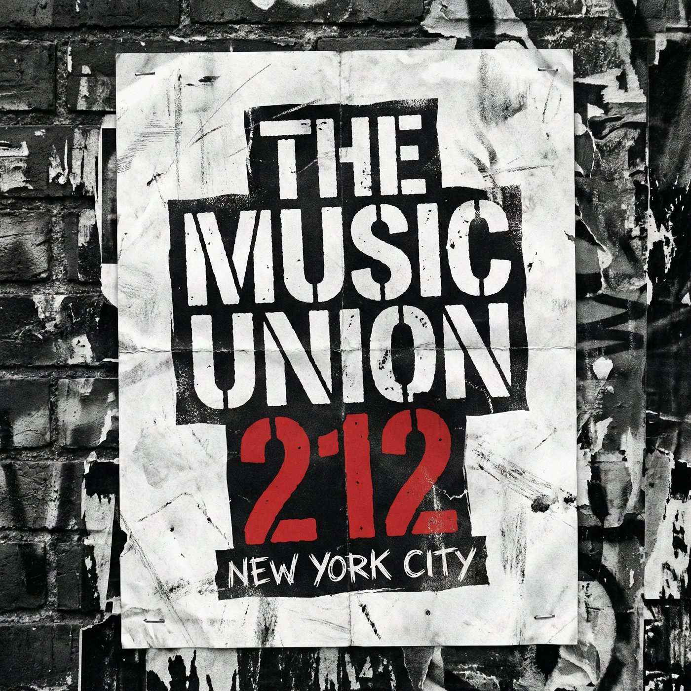
Chapter Logo
| Area Code | 212 |
| City | New York City |
| Style | The Basement — Speakeasy Noir / Prohibition Jazz |
| Palette | Deep midnight blue · Aged gold · Burgundy · Smoke gray |
| Typography | Art Deco serif · Condensed sans-serif · Engraved lettering |
| Materials | Dark walnut · Brass · Velvet · Exposed brick · Subway tile |
| Inspiration | 1920s Harlem jazz clubs, speakeasies, underground music venues |
New York's chapter identity draws from the city's rich underground music history — the speakeasies of the Prohibition era, the jazz clubs of Harlem, and the punk venues of the Lower East Side. The visual language is dark, intimate, and deliberately hidden. The logo is rendered in engraved Art Deco lettering with a keyhole motif. The exterior is an unmarked brownstone with a single brass door knocker. Inside, the space unfolds into a multi-level jazz club with dark walnut paneling, brass rail bars, burgundy velvet curtains, and subway tile accents.
Chapter 313: Detroit, Michigan
"The Assembly — Industrial Soul / Motown Machine"
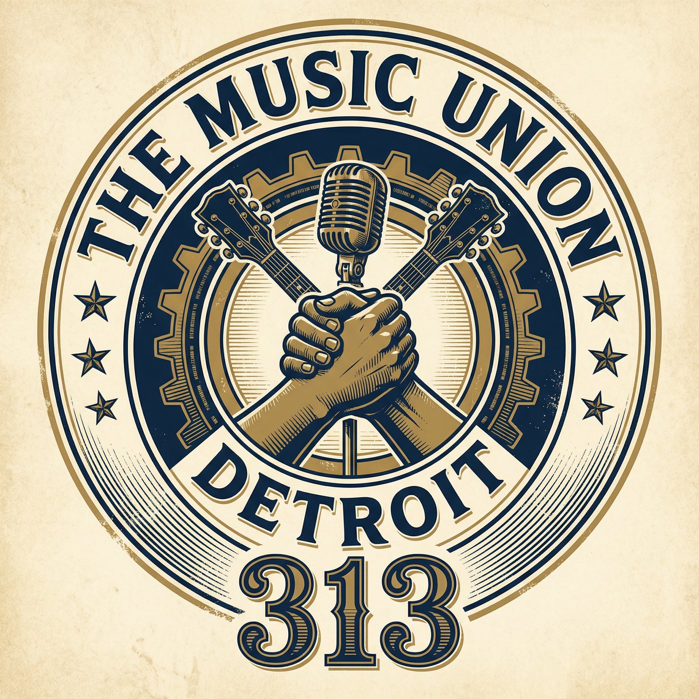
Chapter Seal
| Area Code | 313 |
| City | Detroit, Michigan |
| Style | The Assembly — Industrial Soul / Motown Machine |
| Palette | Gunmetal gray · Chrome · Burnt orange · Signal yellow |
| Typography | Heavy industrial sans-serif · Stencil · Blueprint mono |
| Materials | Raw steel · Chrome · Rubber · Corrugated metal · Factory glass |
| Inspiration | Auto factories, Motown recording studios, techno warehouses |
Detroit's chapter channels the city's dual identity as the birthplace of both the American automobile and Motown Records. The Industrial Soul aesthetic merges factory-floor rawness with the warmth of classic soul music. The color palette is dominated by gunmetal gray and chrome, punctuated by burnt orange and signal yellow safety accents. The logo resembles an automotive badge or factory stamp. The exterior is a converted auto plant with massive industrial windows, exposed steel I-beams, and a giant illuminated factory-style sign.
Chapter 213: Los Angeles, California
"The Lot — Sunset Deco / Cinematic"
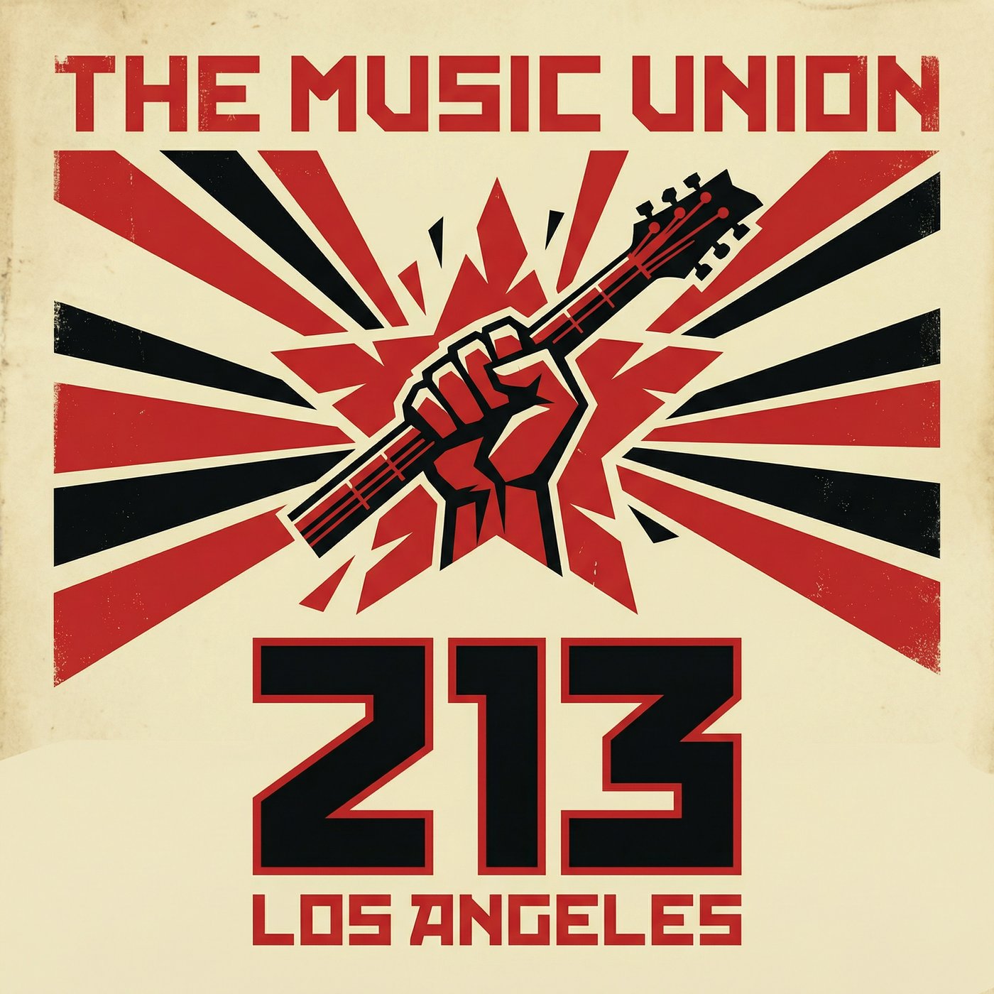
Chapter Logo
| Area Code | 213 |
| City | Los Angeles, California |
| Style | The Lot — Sunset Deco / Cinematic |
| Palette | Warm black · Sunset coral · Palm green · Cream · Rose gold |
| Typography | Elegant Art Deco display · Script accents · Clean geometric sans |
| Materials | Terrazzo · Rose gold · Palm wood · White stucco · Neon glass |
| Inspiration | Golden age Hollywood, Sunset Strip, mid-century modern, film studios |
Los Angeles brings cinematic glamour to the Music Union brand. The Sunset Deco aesthetic merges golden-age Hollywood elegance with the laid-back warmth of Southern California. The color palette features warm black grounded by sunset coral, palm green, and cream with rose gold metallic accents. The logo is rendered in elegant Art Deco lettering with a palm frond and sunset motif. The exterior is a restored Art Deco theater facade with terrazzo floors, palm-lined entrance, and a vintage marquee.
Chapter 312: Chicago, Illinois
"The Ballroom — Jazz Age Deco / Cotton Club"
Chapter Crest
| Area Code | 312 |
| City | Chicago, Illinois |
| Style | The Ballroom — Jazz Age Deco / Cotton Club |
| Palette | Deep navy · Antique gold · Ivory · Crystal white |
| Typography | Ornate Art Deco serif · Geometric display · Engraved script |
| Materials | Marble · Gold leaf · Crystal · Navy velvet · Brass |
| Inspiration | 1920s Chicago jazz scene, Cotton Club, Art Deco architecture |
Chapter 312 embraces Gatsby-era opulence. This chapter feels like a luxurious step back in time to the 1920s. The visual identity relies on deep navy and antique gold, featuring intricate geometric sunburst patterns, chevrons, and stepped architectural forms. The exterior is a restored movie palace facade with gold-leaf mosaic tile and brass-framed doors. The interior functions as a full Cotton Club-style ballroom with crystal chandeliers, a gold proscenium arch stage, navy velvet banquettes, and a curved brass bar.
Chapter 615: Nashville, Tennessee
"The Record — Vintage Vinyl / Analog"
Chapter Logo
| Area Code | 615 |
| City | Nashville, Tennessee |
| Style | The Record — Vintage Vinyl / Analog |
| Palette | Espresso brown · Amber · Cream · Copper |
| Typography | Rounded retro serif · Halftone textures · Record label lettering |
| Materials | Copper · Reclaimed wood · Vinyl · Leather · Edison bulbs |
| Inspiration | Stax, Motown, Blue Note, golden era recording studios |
In Music City, the chapter identity pays homage to the golden era of recording studios and classic record labels. The aesthetic is warm, soulful, and deeply analog. The color palette features warm espresso brown, amber, and cream with halftone textures. The circular logo mimics a vintage vinyl record label. The building is an inviting neighborhood storefront with a giant hand-painted vinyl record mural and marquee bulb signage. The interior serves as an intimate listening room with floor-to-ceiling vinyl shelves, a baby grand piano, reclaimed wood surfaces, Edison bulbs, and a Persian rug on the stage.
Chapter 305: Miami, Florida
"Electric Night — Neon Noir / Futuristic"
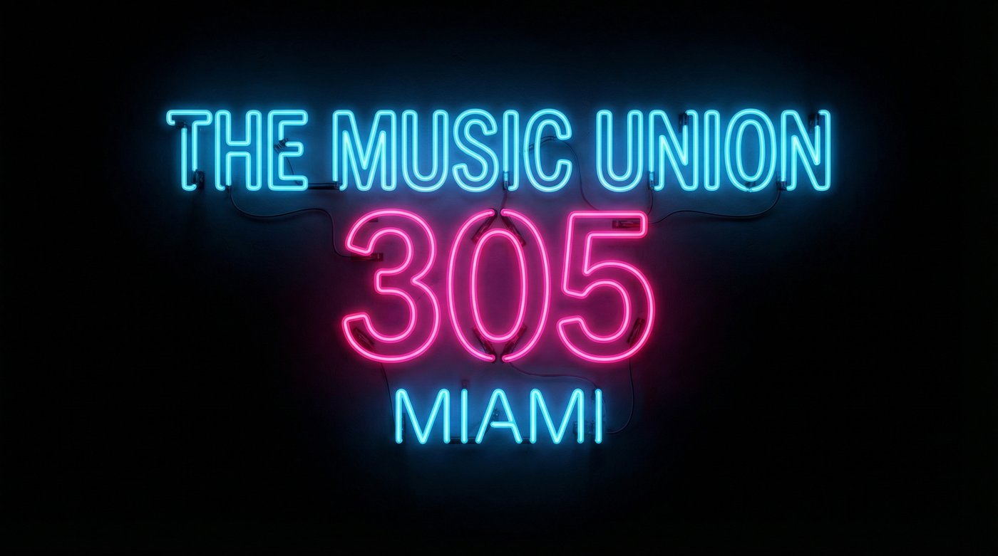
Chapter Logo
| Area Code | 305 |
| City | Miami, Florida |
| Style | Electric Night — Neon Noir / Futuristic |
| Palette | Pure black · Electric blue (#00E5FF) · Hot magenta (#FF00FF) · Holographic |
| Typography | Clean geometric sans-serif · Neon tube lettering · Glow effects |
| Materials | Matte black aluminum · Holographic film · LED · Neon glass |
| Inspiration | South Beach nightlife, electronic music, Art Basel, cyberpunk |
Miami's chapter reflects the city's electric nightlife, electronic music scene, and vibrant visual culture. The Neon Noir aesthetic is futuristic, late-night, and entirely illuminated by artificial light. Every surface in the visual identity is pure black, allowing electric blue and hot magenta/pink neon to serve as the sole light source. The logo is rendered as photorealistic glowing neon tubes. The exterior is a dark industrial warehouse that comes alive at night with spectacular neon signage reflecting off rain-slicked streets.
Implementation Strategy
When rolling out new chapters, the master brand provides the structural framework — the app, the national website, the core business model — while the local chapter identity dictates the physical build-out, the local merchandise, and the chapter-specific marketing materials. This ensures that a member from Austin traveling to New York feels they are in the same organization, but experiencing a completely different, locally authentic environment.
What Stays Consistent
| Element | Description |
|---|---|
| Union Card System | Same three tiers (Rehearsal, Union, Founding) across all chapters |
| Zone Model | Zones A–G operational structure replicated at every location |
| App & Platform | Unified booking, membership, and community platform |
| Brand Voice | Authoritative, collective, honest tone across all communications |
| Pricing Structure | Consistent tier pricing with local market adjustments |
What Changes Per Chapter
| Element | Description |
|---|---|
| Visual Identity | Logo treatment, color palette, typography, and graphic style |
| Physical Build-Out | Interior design, materials, furniture, and environmental graphics |
| Membership Card | Material, finish, and engraving style unique to each chapter |
| Merchandise | Chapter-specific designs, colorways, and limited editions |
| Marketing Materials | Local photography, event posters, and social media templates |
| Partnerships | Local venue collaborations, artist residencies, and community ties |
"One Union. Seven cities. Seven identities. Every chapter tells a different story, but they all speak the same language."
Download the original document for full formatting and offline review.
Download Chapter Identity System (PDF)